Case Study /
XING: Email Design System
Design Systems /Email /B2C
XING had 50+ email templates owned by different product teams, each with different colors, fonts and layouts. I led the design and later the product management of a unified email design system that improved creation efficiency by 50%, increased click-through rates by 7% per adoption, and saved the company roughly 600,000 euros per year through a self-service email builder.
01 Context & Challenge
Company Context
XING was Germany’s leading professional network with millions of users across web, iOS and Android. The platform served both B2C (professionals managing their careers) and B2B (recruiters and companies hiring talent). Email was one of the platform’s highest-reach communication channels, touching every user across all product areas: jobs, networking, premium, marketplace, events and more.
The Problem
When I started working on emails at XING in 2017, the situation was fragmented. Over 50 email templates existed on the platform side alone. Marketing had even more, including one-off campaign emails. Each product team owned and maintained their own templates independently. Over time, this led to a visible mess: different colors, different fonts, different layouts, different levels of quality. Some emails reflected the current brand. Others were several iterations behind.

The fragmentation was not just a visual problem. Teams had difficulty updating their emails regularly because there was no shared infrastructure. When XING introduced a corporate identity update, every team had to implement it in their own templates. This was the moment the problem became impossible to ignore.
Despite email being one of XING’s biggest user-facing channels, it was treated as a second-class citizen compared to the Web, iOS and Android design systems. This meant the email system had less organizational attention, but it also meant more freedom to shape the project without heavy process overhead.
Challenges
- 50+ platform email templates with no shared infrastructure, plus a large volume of marketing campaign emails
- No visual standards across teams, leading to brand inconsistency
- Teams could not update their emails efficiently because each template was a standalone effort
- Corporate identity update required implementation across all templates simultaneously
- Email was not treated with the same priority as Web, iOS and Android design systems
- Technical constraints of email clients (Outlook, Gmail, Apple Mail, mobile) limited what was possible in design and code
Goals
- Unify the visual appearance and structure of all emails to one consistent design system
- Build an atomic component architecture that all teams can use to create and maintain emails
- Improve email performance (click-through rates, engagement) through better design and clearer calls to action
- Reduce the time and effort required to create new emails
- Establish email principles that guide design decisions across teams
Success Metrics
Success was defined on three levels. First, improve email performance measurably, tracked through click-through rates and engagement per template adoption. Second, reduce email creation time significantly by providing reusable components and clear documentation. Third, achieve adoption across all teams without mandating it, proving the system’s value through quality and efficiency gains.
02 Discovery & Research
Research Methods
I started the project by organizing a cross-company workshop. The workshop brought together everyone involved with email at XING: brand, marketing, premium, platform marketing and the platform team itself. The goal was to ensure every perspective was represented before defining a direction. I designed and facilitated the workshop to surface shared pain points, conflicting priorities and unspoken assumptions about what email at XING should be.

I structured the discovery as a three-phase process using a diverge-converge model. Phase one was the principle workshop (KW 28/29), where we opened up assumptions and questions before converging on shared priorities. Phase two was initial design (KW 32–34), translating the workshop output into concrete design methods and deliverables. Phase three was unify design (KW 34–36), where everything converged into the first unified system. A formal review checkpoint sat between phases. The entire discovery spanned roughly eight calendar weeks.
After the workshop, I conducted an audit of existing email templates to understand the scope of the fragmentation. The audit covered visual design, content structure, code quality and which systems each template was built in.
Key Findings
Finding 1: There was no shared language for email quality. Each team had different ideas about what a good email looked like. Some prioritized visual polish. Others prioritized speed of creation. Without shared principles, there was no way to evaluate or improve email quality consistently.
Finding 2: The fragmentation was structural, not just visual. It was not simply that emails looked different. The underlying code, templates and workflows were all separate. A design system update could not be rolled out. Every change had to be made template by template, team by team.
Finding 3: Email sat in a unique position. It was influenced by multiple dimensions at XING: brand and mentor identity, tone of voice, code standards, the notification system, LOTSE (the internal guideline system) and the freemium model. Any email design system had to account for all of these inputs without being controlled by any single one.

Finding 4: Teams were willing to adopt a system, but only if it made their lives easier. The workshop revealed that teams were not resistant to standards. They were resistant to extra work. If the design system added complexity, adoption would fail. It had to reduce effort.
03 Design Process
Strategic Direction
The workshop output gave me the raw material. I translated it into two foundational email principles. “Valuable: Encourage me and guide me to success.” “Functional: Make sure I can read and interact, everywhere.” Below these I defined six sub-principles: Playful, Tailor-made, Trustworthy, Concise, Controllable, Inspiring. These principles became the shared language for evaluating email design across the company. Every design decision could be tested against them.

Starting with principles before pixels was a deliberate choice. If I had started with visual design, every team would have debated aesthetics. The principles gave us a shared framework that made those debates productive instead of subjective.
Architecture Decision: Atomic Design
I chose atomic design (Brad Frost’s methodology) for the system architecture. The decision was straightforward: XING already used atomic design for its other design systems. Using the same model for email meant teams could apply familiar mental models. The system was structured in layers: Habitat (the email environment and its constraints), Atoms (the smallest units like colors, typography, spacing), Grid, Spacing, and Image/Cover components.

I explored other approaches early in the process but rejected them. A template-based approach (offering a set of fixed layouts) would have been faster to ship but would not scale. Teams would hit the limits of the templates and start creating workarounds, recreating the fragmentation problem. The atomic approach required more upfront investment but created a system that could flex with new use cases without breaking.
Exploration and Validation
I designed the system components and assembled them into new email layouts. These were not shipped as finished designs. I ran more than 6 rounds of user testing across products, collecting both quantitative and qualitative data. Every rollout was A/B tested against the previous version. This continuous validation loop was critical: it meant the system was built on evidence, not assumptions.
The emphasis on qualitative data alongside quantitative was intentional. Click-through rates tell you what happened. User feedback tells you why. Both were needed to make confident design decisions.
System Deliverables
The system was delivered in two formats: code components that engineers could use directly, and a Sketch file for designers. The Sketch file included a built-in onboarding section with practical guides for each component type: basics, header, image teaser, footer, stacking, image and textfields. Each section walked designers through how to use that specific component correctly. This onboarding was not a separate document. It was part of the design file itself, so every designer who opened the file encountered it.
04 Solution
Overview
I shipped a unified email design system covering all platform emails at XING. The system included atomic components in code and Sketch, foundational principles and sub-principles, validated layouts tested through continuous A/B experimentation, and documentation with built-in onboarding. Later, a self-service email builder for marketing emerged organically from the project.
Feature Walkthrough
Principle-driven design foundation. The two foundational principles (Valuable, Functional) and six sub-principles gave every team a shared framework for making design decisions about email. This was not abstract guidance. Each principle was specific enough to evaluate a design against: “Does this email encourage me and guide me to success? Can I read and interact with it everywhere?”
Atomic component library. Components were built as composable units that could be assembled into different email types while maintaining visual consistency. Because the system used the same atomic design methodology as XING’s other design systems, the learning curve for teams was minimal. Updates to atoms (colors, typography, spacing) propagated through all emails using them.
Continuous A/B testing framework. Every redesigned email was rolled out with A/B testing against the previous version. This protected against performance drops and built a growing body of evidence about what worked. The framework was not a one-time effort. It was baked into the ongoing process of email evolution.
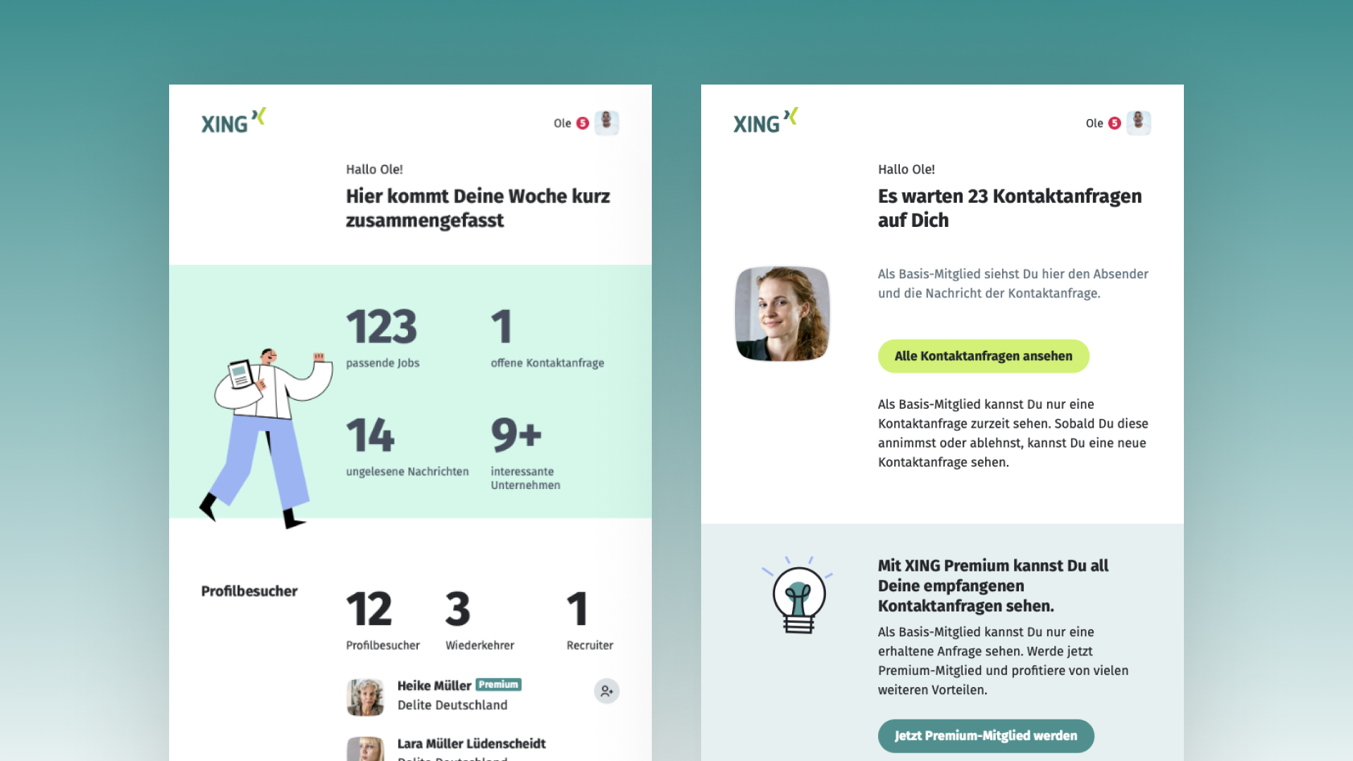
Self-service email builder for marketing. This was not planned from the start. As the design system matured, the marketing team saw an opportunity to build their own emails using the components rather than relying on external agencies. I built a front-end email builder that enabled this. The tool eliminated the agency dependency and saved XING roughly 600,000 euros per year.
Email Types Covered
The system served a wide range of email types, demonstrating its flexibility across different content needs: weekly summaries with data visualizations (profile visitors, jobs, messages, contact requests), transactional notifications (profile visits, new messages, ad status updates), premium upsell and freemium conversion emails, registration and onboarding flows, content engagement emails (group posts, likes, comments), and marketing partnership emails (e.g. WELT/XING News).
Cross-client Considerations
Email design operates under severe technical constraints. Outlook, Gmail, Apple Mail and mobile email clients each render HTML and CSS differently. The atomic approach helped here: cross-client compatibility was solved once per component rather than per template. When a component rendered correctly across clients, every email using that component inherited that compatibility.
05 Implementation & Iteration
Phase 1: Foundation (2017–2018)
The first phase covered the workshop, principle definition, system architecture, component development and initial rollout. I worked with a PM and 3–4 engineers with different backgrounds. I led the design while the engineers built the code components. Each email rollout was validated through A/B testing. This phase established the system and proved its value through measurable performance improvements.

Phase 2: XDL Transition (Late 2018 onward)
When XING introduced the XING Design Language (XDL) in late 2018, it triggered a full visual overhaul: new colors, typography and components across all products. For the email system, this meant updating every component and every template. I took this as an opportunity to step into the product owner role. I organized the redesign discovery and managed the development implementation. Every XDL update to the email system was tested through the same A/B experimentation framework. No update shipped without validation.

The XDL transition also introduced illustrated elements to the email system. Post-XDL emails featured custom illustrations (characters, icons, visual metaphors) that did not exist in the original design system. This was a notable design evolution: the emails moved from purely typographic and layout-driven to incorporating visual storytelling elements that reinforced the XING brand personality.
Phase 3: Scaling and Ownership (2019–2021)
In the later phase, my role expanded. I was running the email design system from both a design and product management perspective, working with 2–3 engineers. This dual role gave me full ownership over the system’s direction, priorities and quality. Adoption across teams was driven by a mix of documentation, the built-in Sketch onboarding and hands-on support. I worked directly with teams to help them use the system correctly rather than relying on mandates or compliance.
Adoption Strategy
Adoption was never forced. Teams adopted the system because it made their work easier. The documentation and Sketch onboarding lowered the barrier. Hands-on support built trust. The A/B test results proved the system improved performance. This combination meant teams chose to use the system rather than being told to.
06 Outcomes & Impact
| Metric | Result |
|---|---|
| Email creation efficiency | +50% improvement |
| Click-through rate | ~7% increase per email adoption |
| Marketing cost savings | ~600,000 euros/year via self-service email builder |
| Templates unified | 50+ fragmented templates consolidated into one system |
| Testing approach | 6+ user test rounds, continuous A/B testing on every rollout |
The efficiency improvement meant teams spent less time building and maintaining emails and more time on content strategy. The click-through rate increase was measured per template adoption: each email that moved to the new system saw an approximately 7% improvement. The marketing email builder eliminated an entire external agency dependency.
Qualitative Impact
The email principles gave the company a shared language for email quality that did not exist before. Teams could evaluate and discuss email design using the same framework. The continuous A/B testing culture changed how the team approached email changes: nothing shipped on assumption alone.
Organizational Impact
This project established the first unified email design system at XING. It introduced email principles that became the standard for evaluating email quality. The self-service email builder for marketing created a new capability that did not exist before the project. My role evolved from lead designer to combined designer and product owner, reflecting the system’s growing scope and strategic importance.
The project also revealed an organizational blindspot. Email was XING’s biggest user-facing channel by reach, but it was never treated with the same priority as the Web, iOS and Android design systems. The email system operated somewhat under the radar: less visibility, less organizational attention, but also more autonomy and speed. This trade-off shaped how the project evolved and is something I would push to change if I ran the project again.
07 Learnings
A design system only works if people use it. I learned this early and it shaped every decision. The built-in onboarding, the hands-on support, the A/B testing that proved performance gains: all of these were adoption tools, not just design deliverables.
Starting with principles before pixels was the highest-leverage decision in the project. It gave every team a shared framework before anyone debated visual direction. It turned subjective design conversations into productive ones.
The one thing I would approach differently: I would push harder for the email design system to receive the same organizational standing as the Web, iOS and Android systems. Email was the biggest channel, but because it was treated as separate, it never received proportional attention or resources. Flying under the radar had advantages, mainly speed and autonomy. But it also meant the system’s strategic importance was undersold internally.
Building for scale means building for others, not yourself. Every decision I made had to work for teams who would use the system without me in the room. The Sketch onboarding, the principles, the documentation: these were all designed to make the system self-sustaining rather than dependent on my involvement.